Helen is one of the biggest energy companies in Finland. We are their website development partner, continuously improving the user experience of Helen's digital channels.
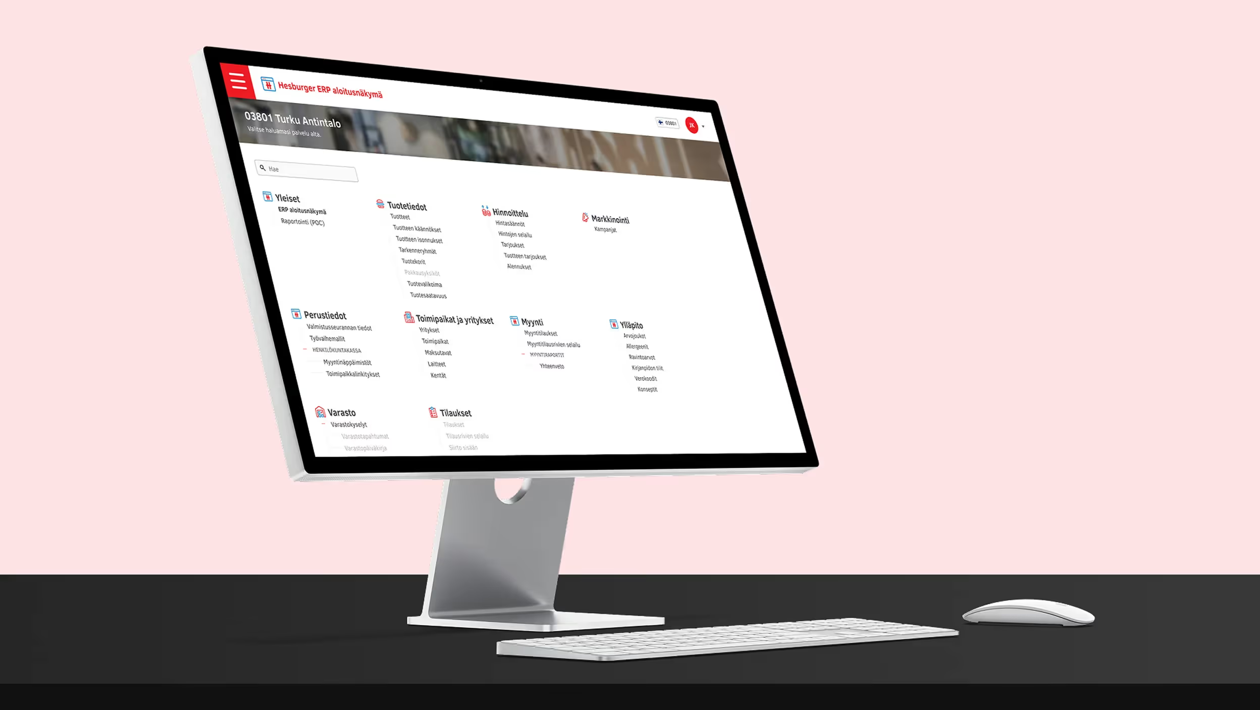
For a company like Helen, getting the information architecture right is an essential part of their online presence. Their website needs to communicate a large number of things to different target groups – and thus, there's always the danger of confusing the users. To tackle this, our UX Designers are continuously working with both Helen's own service design team and their other partners.
Client
Helen
Industry
Energy
Platform
Web
Services
Service design / UX/UI design / Continuous improvement
Awards & nominations
Optimizer Awards 2022 Winner – Most Customer-Centric Experience

Our collaboration is holistic: we have created user flows, supported the creation of Helen's design system, and much more.

When redesigning the customer journeys on Helen's website, the most crucial questions were: how do we make it as easy as possible to order an electricity contract or find out which heating option is best for your housing company?
Creating a smooth user experience whilst taking Helen's business goals into account was no easy feat: there's a great deal of information that needs to be easily available on the site but risks making the experience confusing for the user.


Our approach was communicating directly with the users. Combining different kinds of testing allowed us to better understand how different user groups are searching for information on the site and what the potential bottlenecks are.
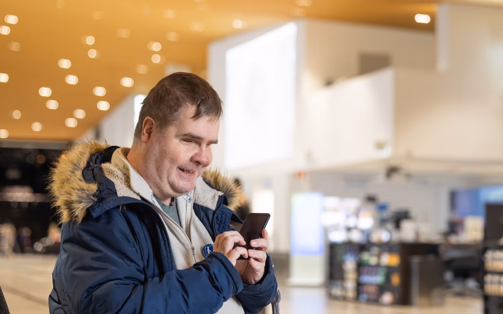
The result is an experience that feels intuitive and welcoming, whether you need a new electricity contract for your apartment or a charging station for your electric car.


Tiina-Kaisa Saukkola
Product Owner, Helen
No matter where you are on your digitalisation journey, we encourage you to get in touch.

Sales
henri.ranki@taiste.com+358 44 500 1364Do you have a new business opportunity or project in mind? Contact Henri or send us a message.

Office Coordinator
vilma.merikanto@taiste.com+358445568459Have a question related to events, co-operation etc.? Our Office coordinator Vilma is happy to help.
Considering applying to work at Taiste? Our HR Manager Laura can aid you with any questions you might have.