Have you ever had the chance to overhaul a service that’s been in use since 1986? One that’s among the most critical tools of a large company, across thousands of locations. I have.
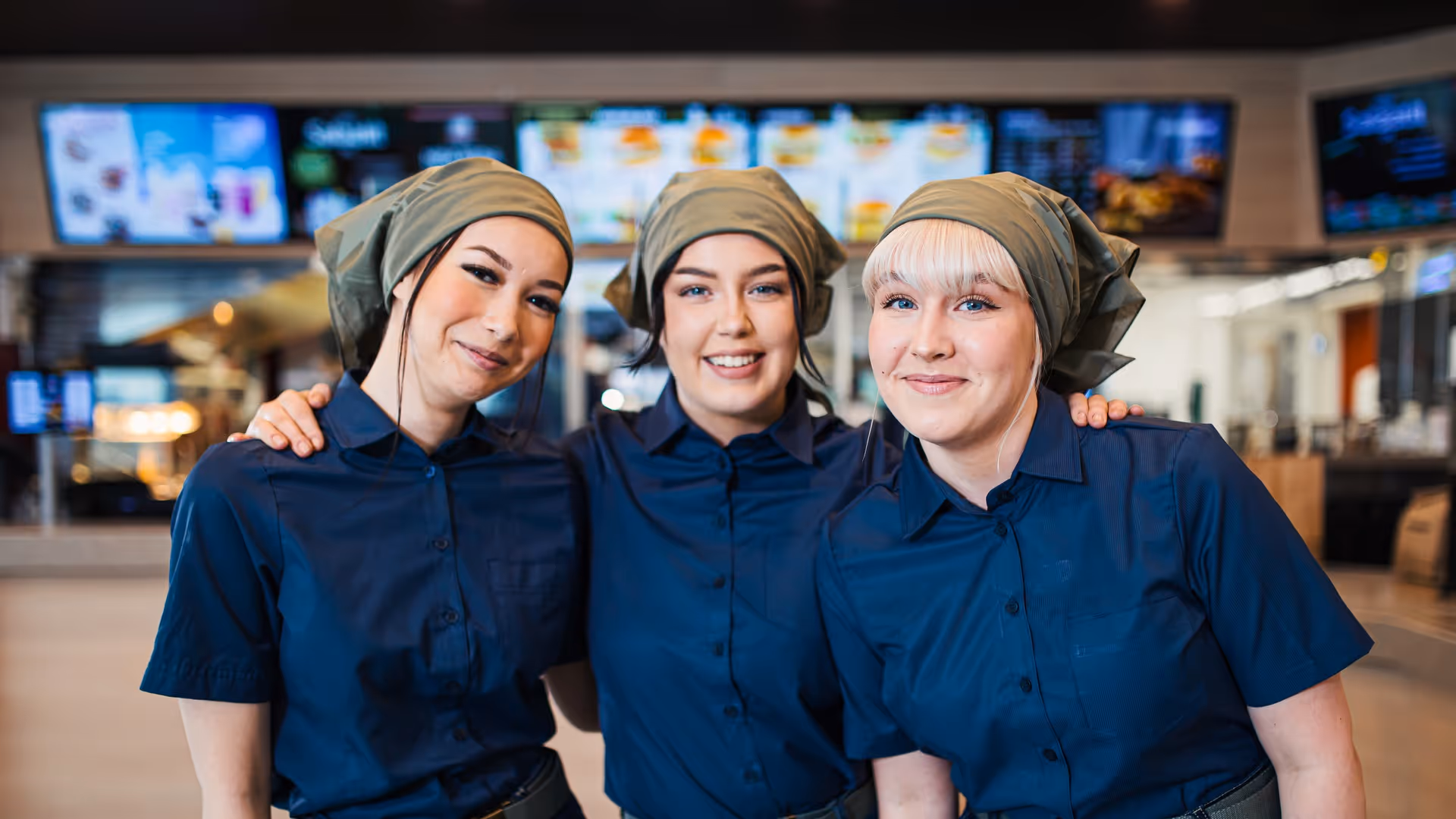
When Hesburger’s Kitchen monitor, which had worked reliably for nearly forty years, was replaced with new software, there was plenty of anticipation in the air, along with excitement. Although resistance to change is often a given in digital service projects, many Hesburger employees were genuinely looking forward to the update. When my design colleague Miika Jääskeläinen and I conducted initial interviews, one comment from an interviewee that really stuck with us was: “Do whatever you like, as long as it’s not like the current one!”
The new system was named the Kitchen app. In this blog post, I’ll walk through the challenges and insights we encountered along the design journey.
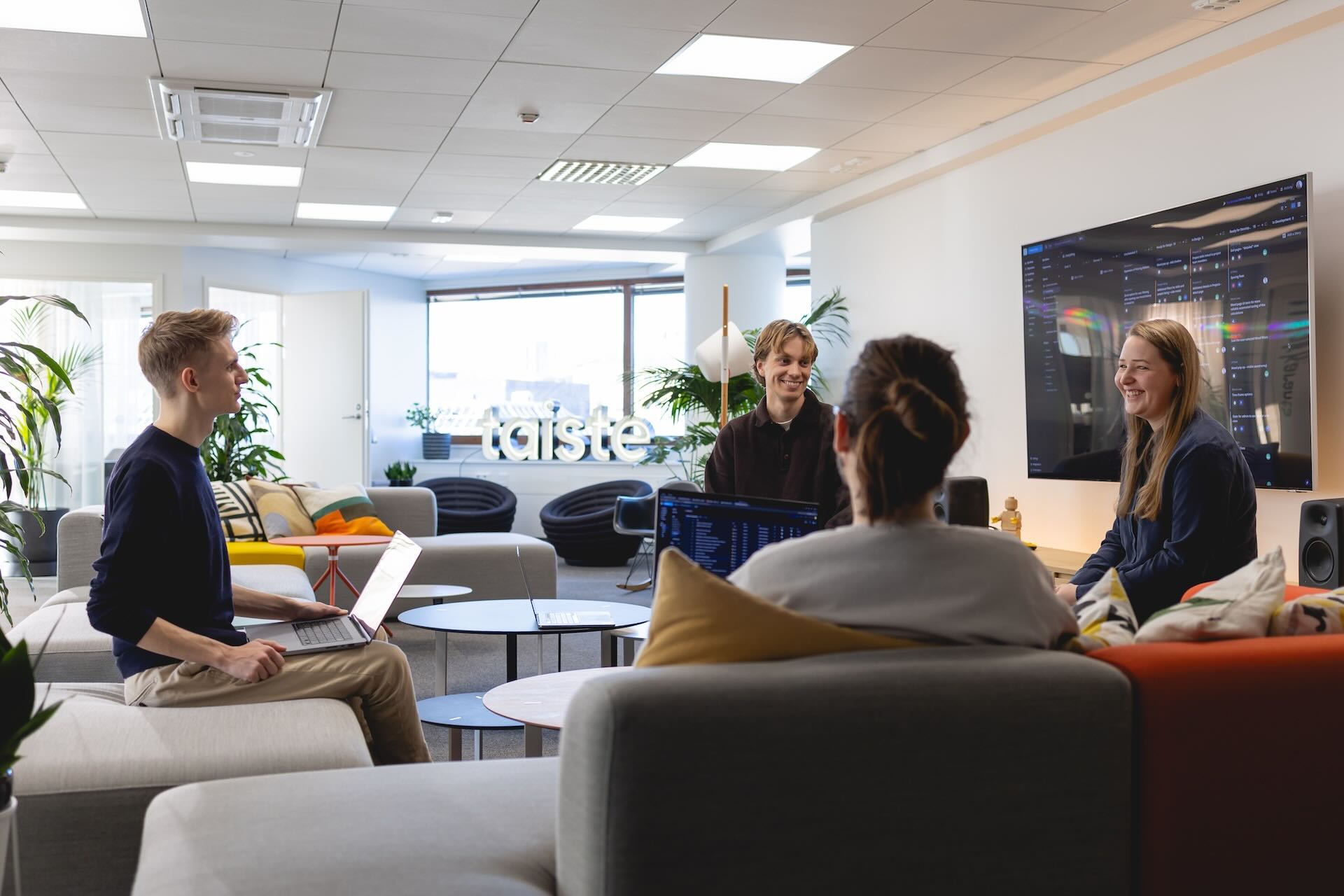
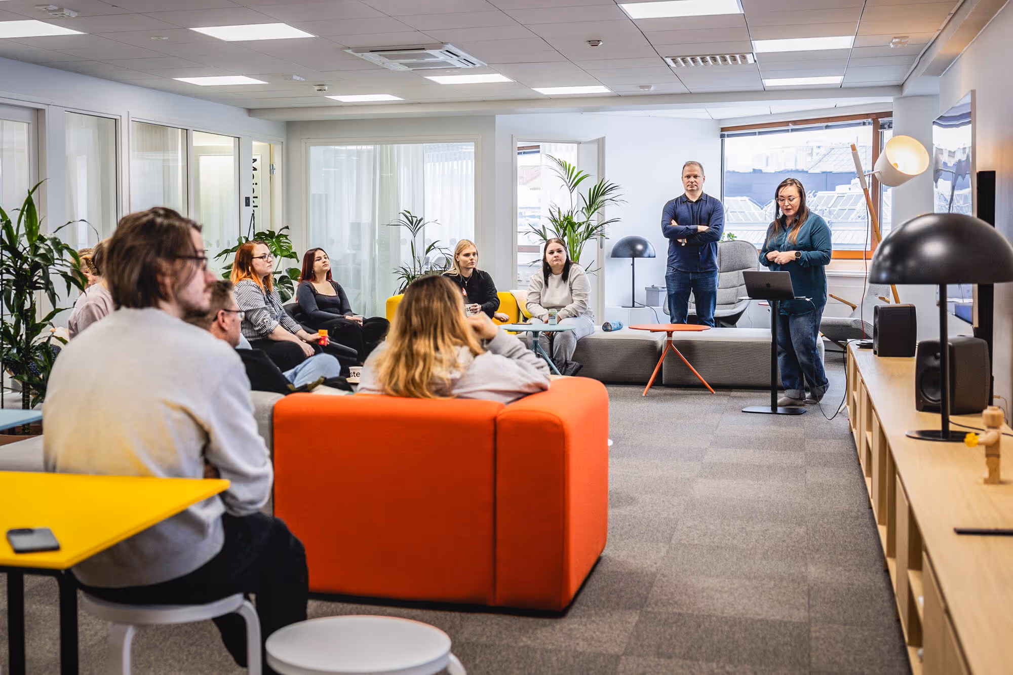
At the start of the project, we carefully mapped out the needs and challenges the new tool would have to address. Because the impact of the changes would be felt widely across Hesburger, gathering perspectives from every level of the organisation was central to the design work. We interviewed restaurant staff and observed them working in a busy restaurant environment. Operational management and regional managers, meanwhile, shared a comprehensive view of strategic goals.
Unlike other fast-food chains, Hesburger prepares products in advance: the burger waits for the customer, not the other way around. This philosophy became one of the cornerstones of the cooking station design. The tool had to be able to anticipate which products restaurants should prepare at any given time. While our technology team was building this machine-learning-based model, it was a major advantage that we already had a detailed understanding of restaurants’ wishes and pain points.
Another cornerstone of our design was user-centred thinking and intuitive use. Every employee needed to be able to pick up the tool quickly. Throughout the design phase, we consistently kept in mind a young employee in their first job, doing their first frying shift. Would each feature be useful to this new Hesburger team member? When weighing different options, ease of use in everyday work always carried the most weight. The Kitchen app had to provide the necessary functions, but also guide employees in the right direction. Our interface always shows what the user needs to keep in mind and do next.
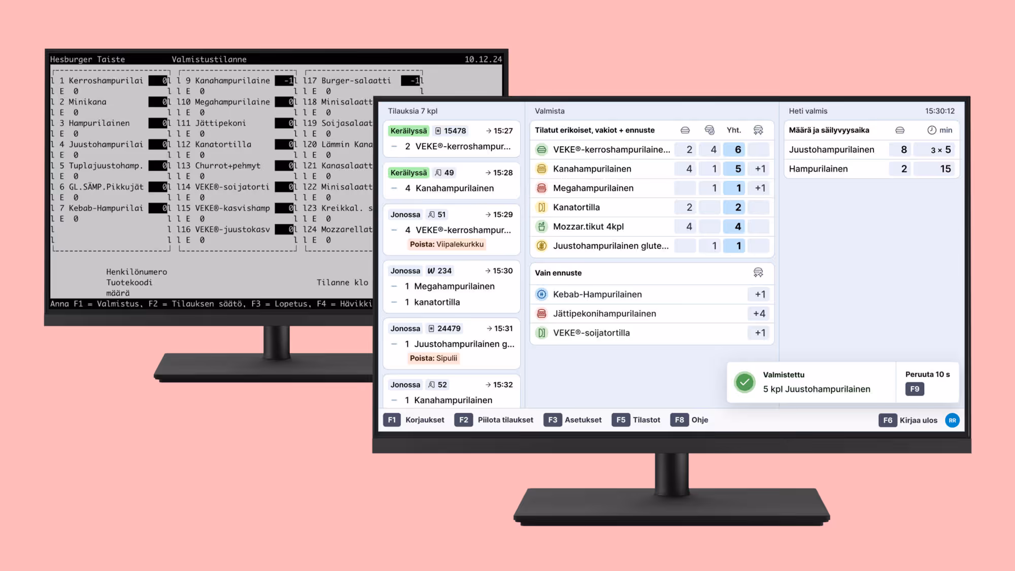
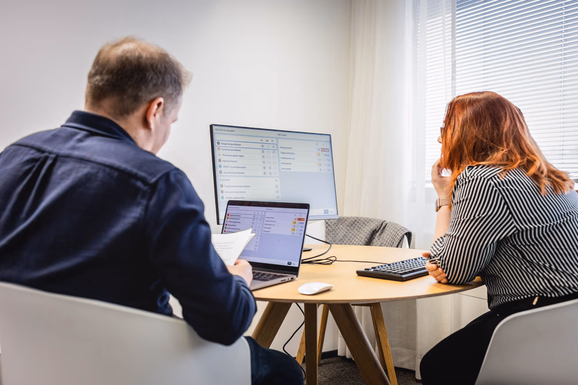
Large displays gave us the opportunity to show, at the same time, practically unlimited numbers of products, order structures, and to communicate priorities clearly.
Digital solutions have naturally evolved a great deal since 1986, but replacing the old tool also meant recognising that some users had been working with the previous system for decades. It was interesting to notice that we also had to let go of certain elements that had worked particularly well for experienced staff. For example, we had to accept that the old Kitchen monitor’s at-a-glance overview of all products simply would not be possible in a modern context.
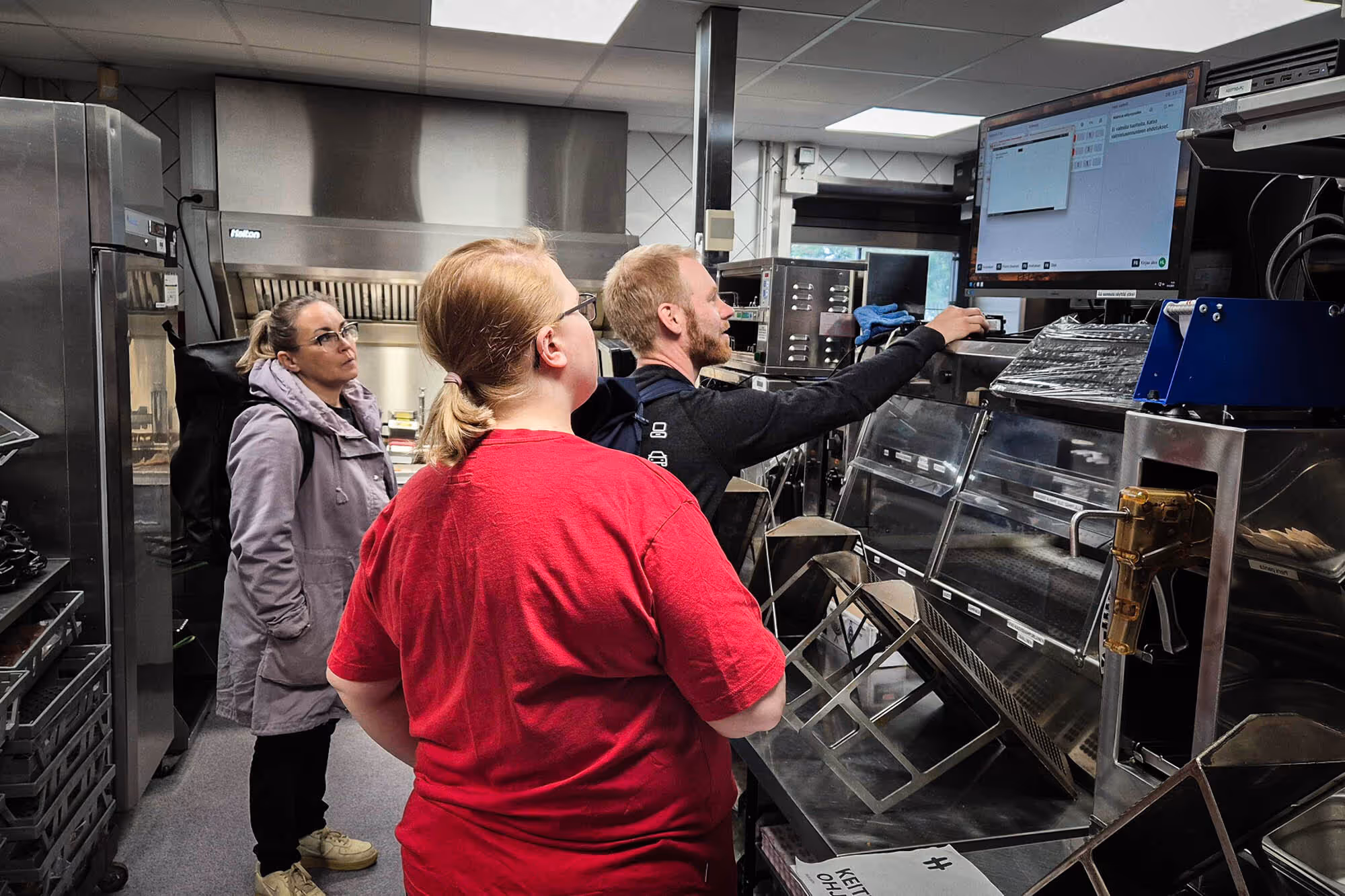
The challenging operating environment added its own flavour to the design process. As its name suggests, the Kitchen app sits right in the kitchen, surrounded by hot oil and high temperatures. For durability and hygiene reasons, its keyboard is covered daily with fresh cling film. Hygiene is also why the tool must be fully usable without a mouse.
In addition, the terminal is often positioned fairly high up, and lighting conditions vary between locations. From an accessibility perspective, we therefore paid particular attention to contrast and readability.
We knew that, despite all our design and testing, the real trial by fire would be piloting the solution in a live environment.
Before the pilot, our developers built a prototype that allowed us to test the whole system using real sales data, and to fix the biggest interface challenges.
Because of our long-running collaboration with Hesburger, we also had clear processes in place with the selected pilot restaurants. These locations were the first to adopt the tools and reported back on their user experiences as well as any issues encountered. This gave employees a meaningful opportunity to influence the final outcome.
The Kitchen app has now moved into production use, but development of the solution continues. This ensures that the system always responds swiftly to the challenges of a rapidly changing and growing business and its employees.
If you’re moving from an old system to a new one, here are a few approaches worth trying in the design journey:
→ Involve users closely from the very start
→ Still be brave enough to make decisions users may question
→ Test thoroughly; true functionality only reveals itself through testing
→ A coded prototype opens up opportunities. It can add significant value and be cost-effective
→ Prepare mentally for things only emerging during the pilot. Don’t cling to solutions; iterate
→ Pilot with a sensible scope and pace. Piloting is the real stress test and takes time
These tips can help you get started, but every operating environment has its own realities. If you need help mapping out a solution for your own company, we’d be happy to help you move forward.