Do you know the feeling when, one morning, you look in the mirror and realise that your favourite shirt just doesn't feel right anymore? That's what we experienced recently. Although instead of a shirt, we were looking at our brand identity – and it wasn't necessarily morning. It's not like we actively disliked our old brand: it had simply began to seem a bit too play-it-safe; decent but somewhat uninspired.
This was hardly surprising. After all, the last time we'd significantly altered the look and feel of our brand was all the way back in 2017. The sense of what a company is changes over time: new people join and the world around us is not the same as it was yesterday. The same holds true for our clients and their needs.
For us, the purpose of brand identity is to communicate who we are right now. And that's why the shirt needed a good wash, and perhaps a fresh dye to boot.
This is the story of how we did it.
So, we had faced the facts and were about to embark on a quest to update our entire brand identity – where does one even begin with a project so daunting?
Our only words of wisdom in this regard are: it takes time, and should probably be done in increments. We figured it would be best to start with what we actually want to say, rather than give in to the temptation to go straight for the visual bells and whistles. And thus, this phase consisted of updating the written content of our website and marketing materials.
In our field of work, the two cardinal copywriting sins to avoid are: a) being incomprehensible and b) being boring. Iteration is the name of the game here –cutting the extra fat and simplifying sentences goes a long way. Throwing in a light-hearted joke or two and avoiding jargon where possible helps, too.
Here's the thing with our marketing content though: we need to create it with both our potential customers and potential new team members in mind. These are vastly different target groups, and finding the right balance is not always an easy task. There was a lot we'd learned from our recent sales endeavours that we wanted to express in our new brand message. But at the same time, we sought to define and communicate our work culture – this was absolutely crucial during a time when we were simultaneously growing fast and still mostly working from our homes.
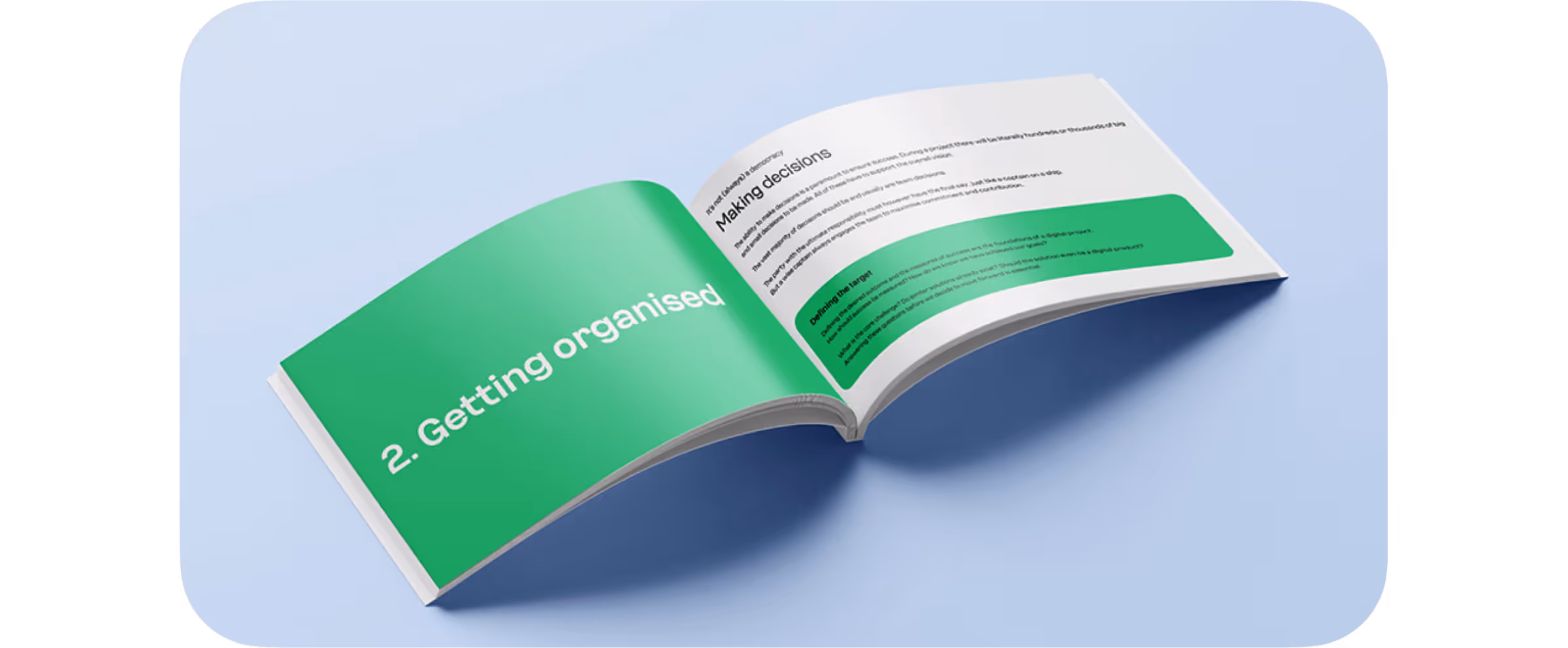
We ended up creating two documents: Working With Taiste, an introduction to our work culture, and Project Handbook, a summary of our philosophy in building digital products. This work was the foundation for the visual side of things, too. It wouldn't be just a makeover – rather, we now knew what we wanted the visual elements to communicate.
Historically, we've always been a bit stubborn when it comes to using external help. Somehow, we've been stuck with this idea that it's more cumbersome trying to explain to someone else what we want than to just bite the bullet and do it ourselves (we also have a habit of being a bit OCD about everything, which doesn't exactly help either).
However, as the company grows and schedules are tight, we've had to realise that this strategy is not necessarily the best fit for all situations anymore. And so, we got in contact with the Helsinki-based Kobra Agency and presented them our case with a slightly nervous tone in our voices.
Teaming up with Kobra, we soon found out was that there are more benefits to working with an external agency than easier time management. The most important being new perspectives. The old cliché about being too close to something and becoming blind to it is true – what we really needed was to properly shake things up, and this would've been difficult without Kobra challenging our views. As an example: we asked them not to change our old logo but in the first draft, they'd already redrawn it. Talk about giving the customer what they don't even realise they need.
An inspiring brand is like one of those truly great pop songs: approachable and catchy on the surface, yet substantial underneath the layers.

An inspiring brand is like one of those truly great pop songs: approachable and catchy on the surface, yet substantial underneath the layers. And so, finding a visual metaphor that worked on several levels was when it all began coming together. When Kobra suggested using forms and colours inspired by nature, our imagination started racing. Not only did it look appealing and fun; it also made sense in terms of what we wanted to convey. After giving it some thought, we ended up with these mission statements for the visual brand:
We feel so at home in digital environments that they are like a second nature to us. Also, digital is often seen as the opposite of "natural" – but we wanted to toy around with the idea that it can just as easily be seen as a part of nature.
The idea of growth is at the core of how we approach our work and partnerships. The best projects are often the ones where we get to work with a client for a longer time and gradually grow to be a trusted part of their team.
Nature is in constant process of evolving through experimentation. This connects nicely to our iterative way of working: you try things, fail fast, determine what works and what doesn't – and repeat.
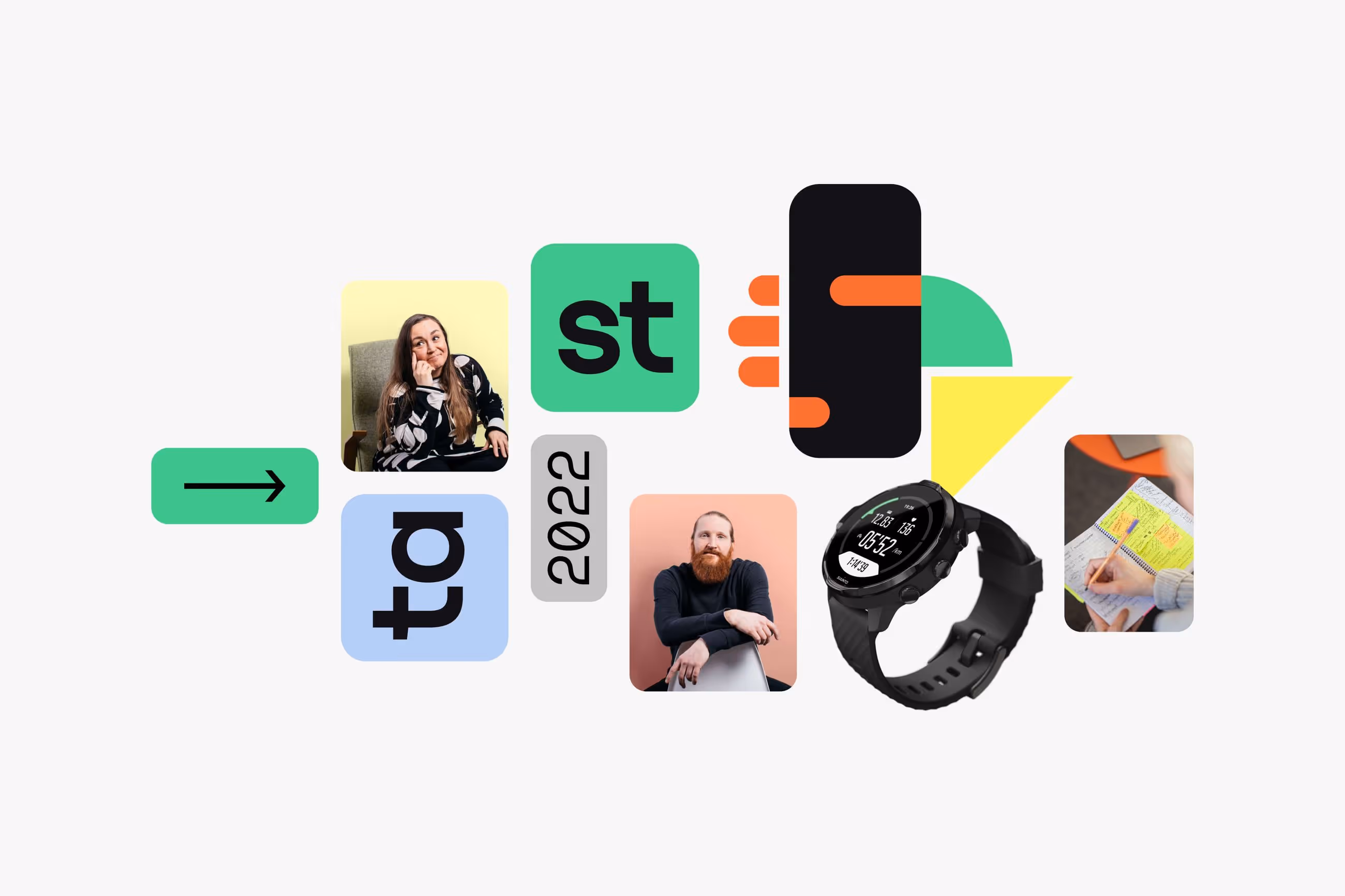
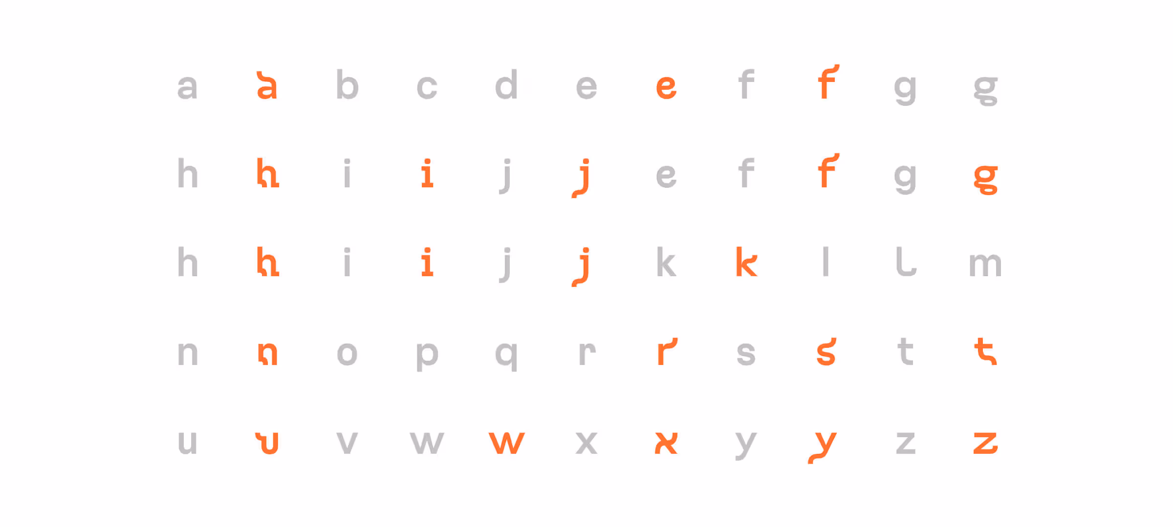
The nature theme can be felt across the design language; even in the custom typography. The tailor-made Taiste Sans family features special, plant-inspired letters used in headlines. The colour palette further supports this connotation with its organic and light scheme. We wanted the overall vibe to be calm and positive – after all, we would like to make the lives of our clients easier and not vice versa.
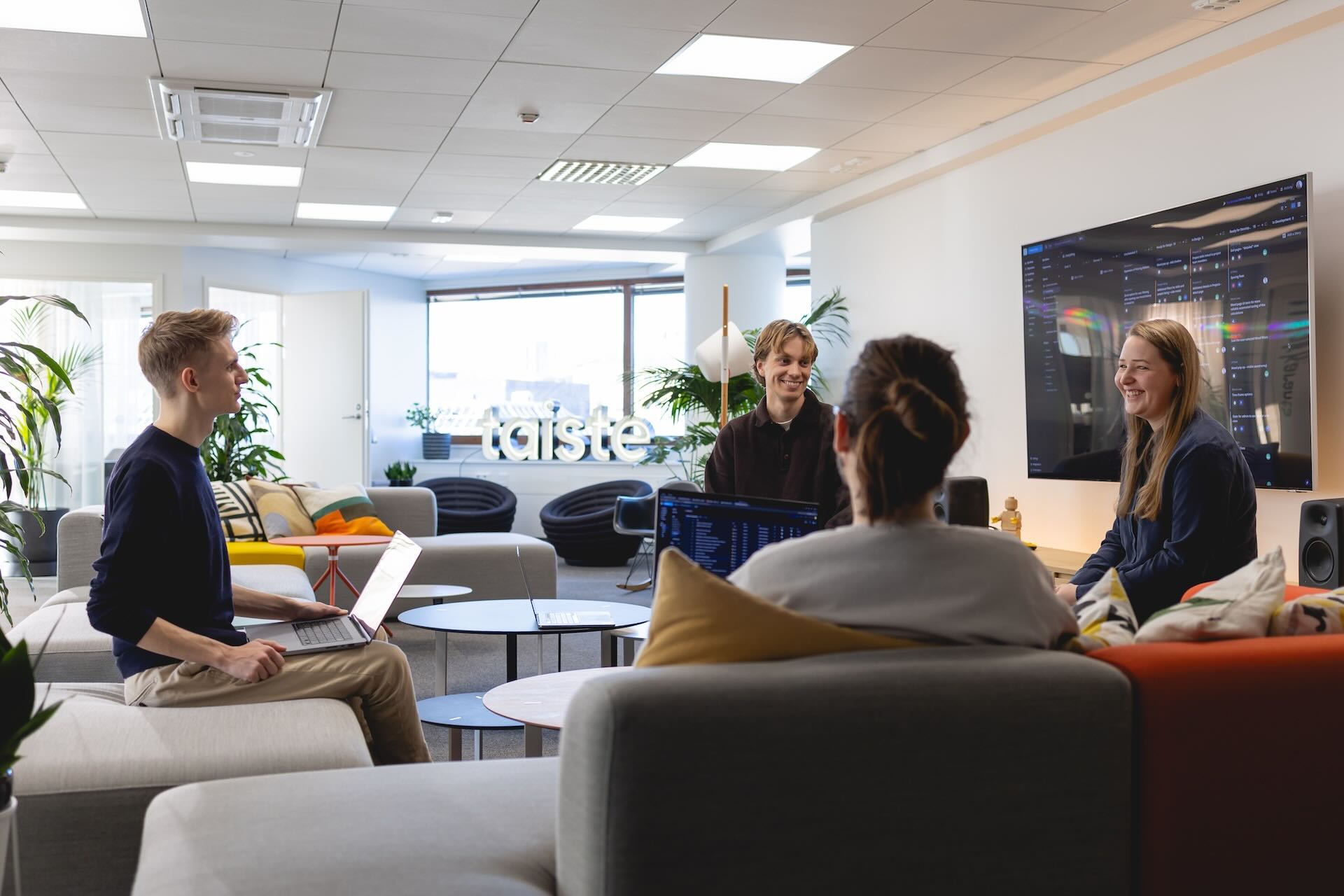
Photos of our team members are featured heavily in our marketing materials to create a strong sense of a meeting point between digital products and the people who make them. These new portraits were taken by Jaska Poikonen and combined with backgrounds highlighting the brand colours.

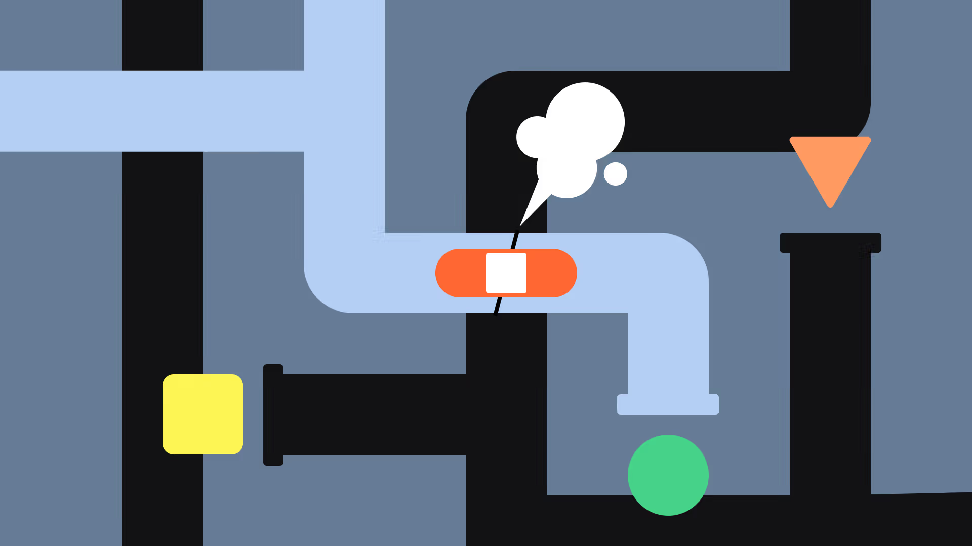
The shapes we use throughout the visual language are simple, yet a little bit rebellious in how they can appear on top of each other and even create recognisable objects in animations when combined. This played well together with the whole idea of experimentation as a part of a creative journey.
The same principle was applied to the brand apparel too: clothing with quirky approaches to using the logo and the colors, laptop stickers that can be either arranged to form the word "Taiste" or, if you're feeling creative, completely different words with the same letters.
This overall feeling of imaginativeness has in many ways been the greatest triumph of this whole endeavour. It has made us understand ourselves and our strengths better, and it promotes the kind of thinking we want to be known for.

This overall feeling of imaginativeness has in many ways been the greatest triumph of this whole endeavour. It has made us understand ourselves and our strengths better, and it promotes the kind of thinking we want to be known for.
One thing we've found ourselves talking about over and over is that even though some kind of intelligence is almost built in to tech companies (coding and UX are essentially problem-solving, after all), it's important to recognise that one can be intelligent in different ways. There's the kind of intelligence that's technically impressive but by itself, can also feel cold and off-putting. What we strive for instead, is to be seen as approachable co-operators. Thus, a healthy dose of emotional intelligence in addition to the analytical mindset is crucial when we work amongst ourselves and with others. With the combination of creativity and playfulness, this is what the new brand conveys.
So now, when we see our reflection in the mirror, the shirt doesn't just look nice – it feels like it was made to be worn by us and seen by others.