Our UX Designer was confronted with a seemingly simple question: why are there two different kinds of numpads? In order to get to the bottom of the mystery, he had to do some good old-fashioned detective work.
The story starts with a Teams call. That’s how they all do for a designer. My guts tell me not to take it, but if there is one thing I cannot turn my back to, it’s customer in distress.
The customer tells me they are implementing a login functionality in their cashier software, and needs me to design a layout for a touch screen number input. “A design for numpad?”, I think to myself while taking a long sip of matcha tea. This should be an easy task.
But I am a hard-boiled designer. I try my best to understand any existing conventions behind design patterns before implementing them in my designs. To solve this case, I know I need to understand how numpad layouts are currently used and where their conventions derive from.
My investigation begins with mechanical calculators. While traveling the dark, overcrowded highways of Internet, I stumble on two names that stir my interest. First one is a French engineer called Jean-Baptiste Schwilguć. In 1844, he came up with the first working prototype of a key-driven calculator machine. This machine was the first to use a numerical keyboard with a single row of keys that increased from 1 to 9.
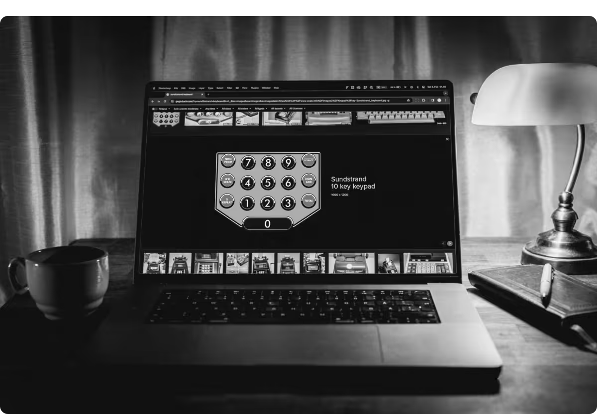
My second lead is an American inventor named David Sundstrand. In 1911he invented an adding machine that was the first to use the so called '3x3above zero' key arrangement. This arrangement became widely adopted and from the 1960’s has been standard layout on calculator and computer keypads.
But why did this particular number layout get so popular? One reason seems to be Benford’s law, aka “First digit law”. It says, that when dealing with arbitrary numbers in calculators, smaller digits like 0, 1 , 2 and 3 occur more often than larger ones. Design-wise, this means that those numbers should reside in the bottom, where they are close to enter and offer easier reach and better ergonomics for the user.
“So this is the convention I was looking for”, I say and pour myself another cup of hot matcha tea. Suddenly, as I was blissfully convinced I had found a convention to follow in my designs, another historical lead turned up – and I had no choice but to see where it would take me.
During the 1950’s the world was about to move from old rotary dialled phones to ones with push-buttons. A company called AT&T had their engineers conduct user studies to determine the key configurations that users would prefer in these Dual-tone multi-frequency signalling “DTMF” numpads.
.avif)
Surprisingly, the conventional calculator layout didn’t do so well, and users preferred left-to-right, top-to-bottom layouts.
During 1960’s the 1-2-3 keypad arrangement prevailed and has since been adapted as an industry standard number layout in phones. The main advantage of this arrangement is that it resembles the order of numbers in rotary dial phones - smaller numbers are high up and 0 at the bottom. It also follows the western standard reading order from left-to-right and top-to-bottom, which makes it more intuitive for people reading text from left to right.
This all makes my head spin. My investigation led not to one, but to two separate conventions for numpad layout. Which one should I follow?

Confused, I stroll the dark rain-soaked streets of Helsinki. How should I start my design work with two contradicting conventions to follow? Desperate and tired, I come across a lonely ATM machine. I am running out of matcha tea, so I insert my credit card to visit a local market nearby. When I start typing in my PIN-code, my mind suddenly opens to a revelation. It was never about CONVENTION, but rather the CONTEXT.
I quickly flip through my notes. It is all too clear now. The context of use should lead my design. The 1-2-3 layout is commonly used for inputting phone numbers, PIN-codes and other identifying series of numbers.These numbers are abstract. They have no MEANING. For PIN-codes or phone numbers we could also use letters or even emojis, but numbers are there for easier memorisation.
It is a different thing for 7-8-9 layout, as it is mainly used in calculators and for inputting concrete quantities. These numbers MEAN something. They could never be replaced with emojis, unless you are happy to receive your salary in smileys.
It was never about CONVENTION, but rather the CONTEXT.
Understanding this difference in the use context, there are many ways to design a usable layout for a number input in your software. Using multiple layouts might very well make sense, as the numbers we input have different meaning in different contexts.
“Case finally closed”, I mutter to myself as I pour myself some newly bought matcha tea and open Figma. Now it’s time to get my hands dirty.