Accessibility means creating digital services that take disabilities into account, making them usable for a larger number of people. For too long, it has been a blind spot for us designers.
Many of us have disabilities that greatly affect everyday life. Accessibility means creating digital services that take this into account, making them usable for a larger number of people.
Historically, accessibility has been a blind spot for both designers and their clients. Too often, it is seen as not worth the trouble or simply not given any thought at all. We have been guilty of this numerous times as well. But now, the times are slowly but inevitably changing.
Historically, accessibility has been a blind spot for both designers and their clients.
In Europe, the EU Web Accessibility Directive will greatly affect this. Any new public sector websites must meet accessibility standards immediately. For pre-existing websites, the deadline is set to September 2020.
In this article, I present an overview of why accessibility is such a big deal – and how we can make the internet better by taking it into account in our designs.
First, let's tackle visual accessibility. This means that anyone should be able to perceive, understand, navigate and interact with the service. The topics I discuss in this section are based on the Web Content Accessibility Guidelines (WCAG).
Colour should complement, not lead. Colour brings interfaces to life, creates atmosphere and enhances branding. That being said, colours are best used when highlighting information that is already visible.

It’s not uncommon that brand colours dictate the palette of the user interfaces. This might lead to accessibility problems, usually with contrast. When background and foreground colours have insufficient contrast, text, icons and other interface elements can become inaccessible.WCAG suggests a perceived contrast of 4.5:1 in order for a website to receive their second-highest AA rating. Reaching the highest AAA level requires offering the users the possibility to modify interface colours and font sizes by themselves.To check the current colour contrast on your site, we recommend using one of the many free tools available, such as Colorable.
Contrast is crucial for written content readability. Not only does this apply to headlines, but also buttons and badges. Text that is part of a logo or brand name must also be taken into account.

To keep text readable, we aim to keep the font sizes at a minimum of 12pt in the tiniest label texts. With longer text sections, it is reasonable to use a font size of 18pt or bigger. It should also be noted that fonts are of different weights and thus, designer discretion is advised. Generally speaking, no one will ever complain that your font is too big.
Text paragraphs should be around 50-80 characters long for optimal reading speed and comprehension. Justification will make distinguishing lines harder while adding a bit of line spacing will make it easier.

Visual accessibility checklist
Accessibility is not limited to what can be perceived at first sight. There are a great number of things under a website's hood we should consider making it accessible for people using screen readers, alternative input devices and other assistive technologies.
Markup tags can make a website's content readable with all devices. Any website should have a structure that's clear and easy to read, even with all visual candy removed. HTML markups are essential in conveying the content and hierarchy of the site. Proper use of markup tags makes it easy to navigate and read the website with assistive technologies. Tags should never be used for merely styling purposes, that's what CSS is for.
Any website should have a structure that’s clear and easy to read, even without any visual eye candy.
The website structure should start from a descriptive page title that gives the visitors an idea of what lies ahead. Likewise, keeping the following heading copy informative will make it easier for all users to understand what you have to say.
Markups are also immensely helpful with more complex interface elements such as forms. Different form sections such as labels, indicators and errors should have their own tags. Also, you should design your forms so that each of these elements is in a logical order when reading with assistive technologies.
Navigating the site with just a keyboard will follow the structure you have created with your markups. Including a visible keyboard focus in elements that can receive input (such as forms and search bars) is critical.
Describe the key visual elements with text. Photos, illustrations and graphs should always come equipped with descriptive text – unless they're just decoration. These alternative text descriptions help people understand an image that is not visible, either due to a disability or even low bandwidth. The same advice goes for video, audio and other multimedia content. With videos, captions should always be included.
Under the hood checklist
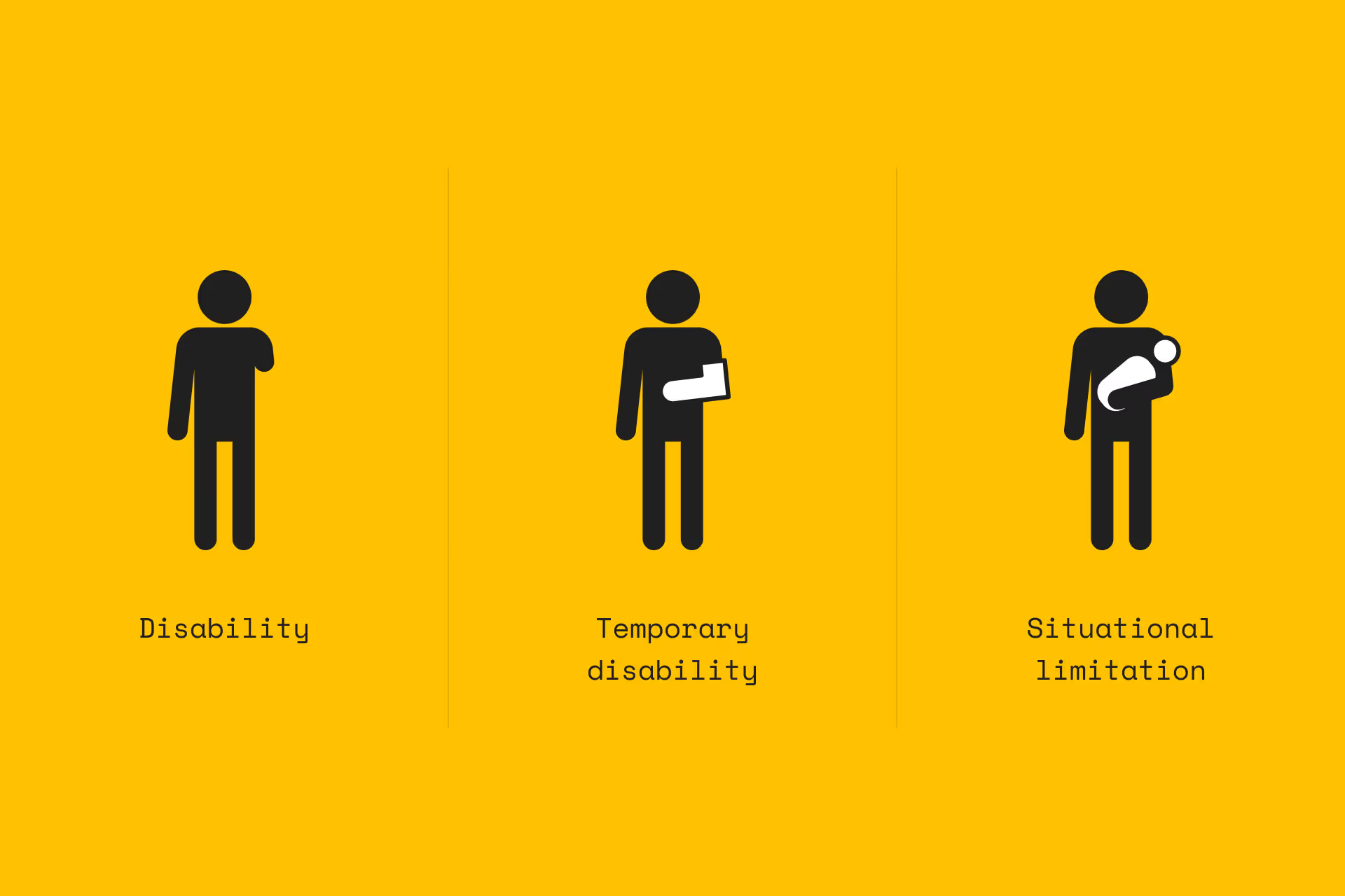
According to the World Health Organisation, 1 in 7 people experience some kind of disability. That makes up for over 1,1 billion individuals. This is made even more staggering by the fact that this number only includes those with permanent disabilities.
Let's face it, we all experience temporary disabilities. It can be something major like a broken arm, or situational such as carrying a baby. Accessibility, then, not only helps the disabled (which in itself would be a big enough reason) but also everyone else. This is called the curb cut effect: solutions that are helpful to some are often helpful to everyone else, too. It is frankly baffling that to us designers, it is so often treated as an afterthought. Let's change that – starting now.
Are you interested in finding out how you could make your digital service more accessible? We should definitely talk. Read more about our accessibility services here.